


Brand Guidelines
The ultimate guide to executing Fifth Edit’s visual identity consistently
Sections
01.
02.
03.
04.
05.
External Assets
01.
02.
03.
04.
05.
About
-
To transform the way independent creators and small businesses build their brands by making the process clear, focused and empowering. Fifth Edit exists to give every client a brand they’re proud to own and the tools they need to show up with confidence — not just a logo, but a complete foundation for growth.
-
We make branding simple, structured and empowering for independent creators and small businesses. In just 5 weeks, our done-for-you experience delivers a complete brand build — strategy, design, website, and content — so clients can launch or level up with a strategic, hard-working brand, plus the confidence and tools to use it every day.
-
Our core service is The Brand Incubator, a 5-week experience designed to transform brands, from strategy to implementation.
-
We work with independent creators and small businesses who are ready to invest in a brand that truly works for them. They’re tired of patchwork fixes and piecemeal solutions — they want everything handled in one place by a collaborative expert with a strategic process. They value clarity and structure and ultimately want a brand they’re proud to own, along with the confidence to put it into action every single day.
-
Fifth Edit brings rare creative firepower to the small studio space. With over a decade of experience shaping the visual language of major media brands, we combine editorial-level design expertise with a refreshingly focused, collaborative approach. Through a structured five-week process, we deliver an entire brand system — strategy, visuals, website, and content kit — all in one place. No scattered timelines. No guesswork. Just a proven process that transforms brands and equips clients to use them with confidence from day one.
-
Direction: We help clients get their bearings and move with purpose. Every design system we build includes a clear plan for implementation — so clients know what to do next and why it matters.
Confidence: Design should be empowering, not overwhelming. Our process is built to instill confidence in our clients — in their brand, in their decisions and in how they show up to the world.
Craft: We’re obsessed with design that works hard and looks amazing. Every system we build is rooted in strategic thinking and elevated with top-tier creative execution.
Collaboration: Great brands are built together. We listen closely, communicate openly and create an experience that feels personal and supportive from start to finish.
Sustainability: We design for now and for next. The systems we build give clients tools they can actually use, empowering them to scale, evolve and grow long after launch.
-
Fifth Edit is confident, approachable, and deeply invested in helping clients succeed. We take branding seriously and weave warmth and wit into the way we work — keeping the process enjoyable without ever losing focus. Expect an experience that’s structured and strategic, yet human and personal. We’re professional and polished but never cold, balancing big-picture strategy with creativity and just enough personality to keep the work fun. Clients feel supported, understood, and excited — not overwhelmed.
Keywords: Approachable, Strategic, Collaborative, Clever, Confident
-
Our voice is professional but never stiff, confident but never smug. We aim to educate, guide, and inspire — making complex branding concepts feel simple and approachable. We keep things conversational and human, while weaving in moments of wit and personality where they naturally fit.
Keywords: Clear, Warm, Strategic, Clever, Supportive
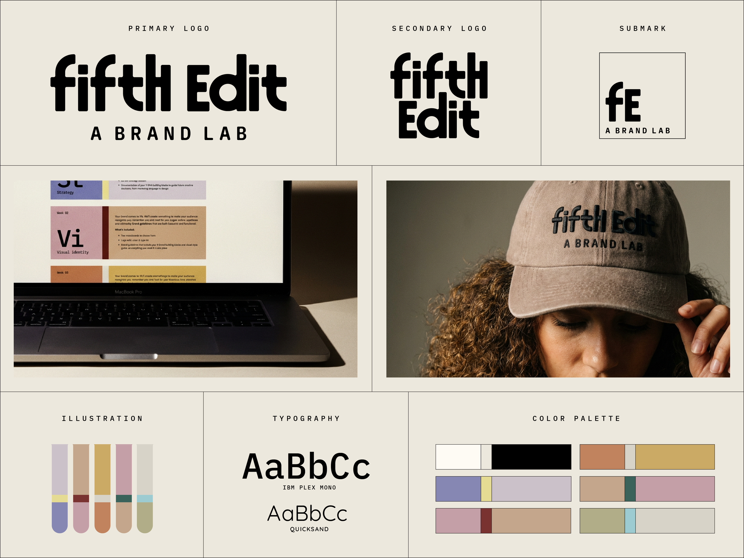
Logo suite
Our logo is the most recognizable element of our brand — a visual shorthand of who we are and what we’re about.
We’ve crafted a scalable suite to ensure our brand is clear, memorable and versatile enough for every touchpoint.
Follow the guidelines below to ensure the best representation of our brand.
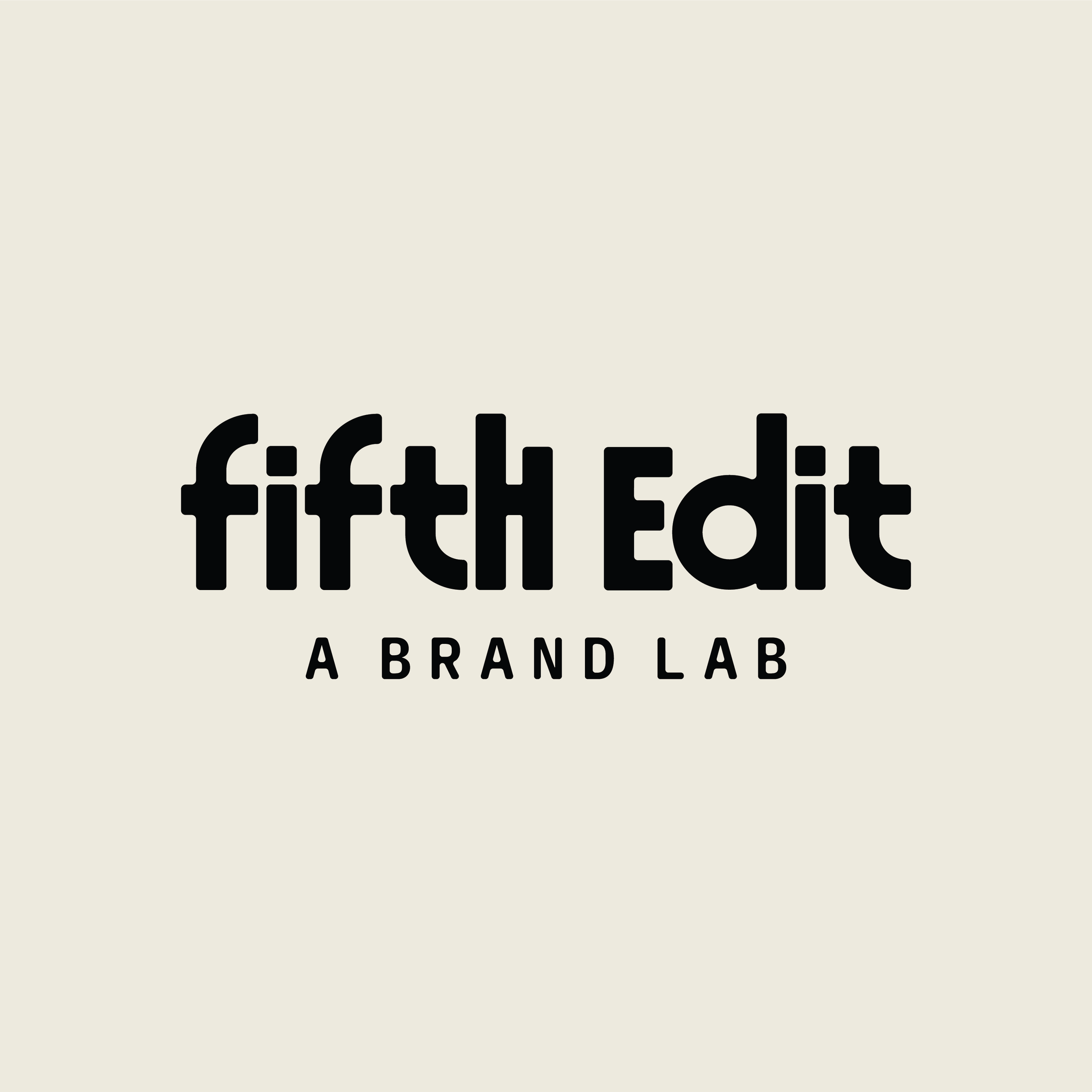
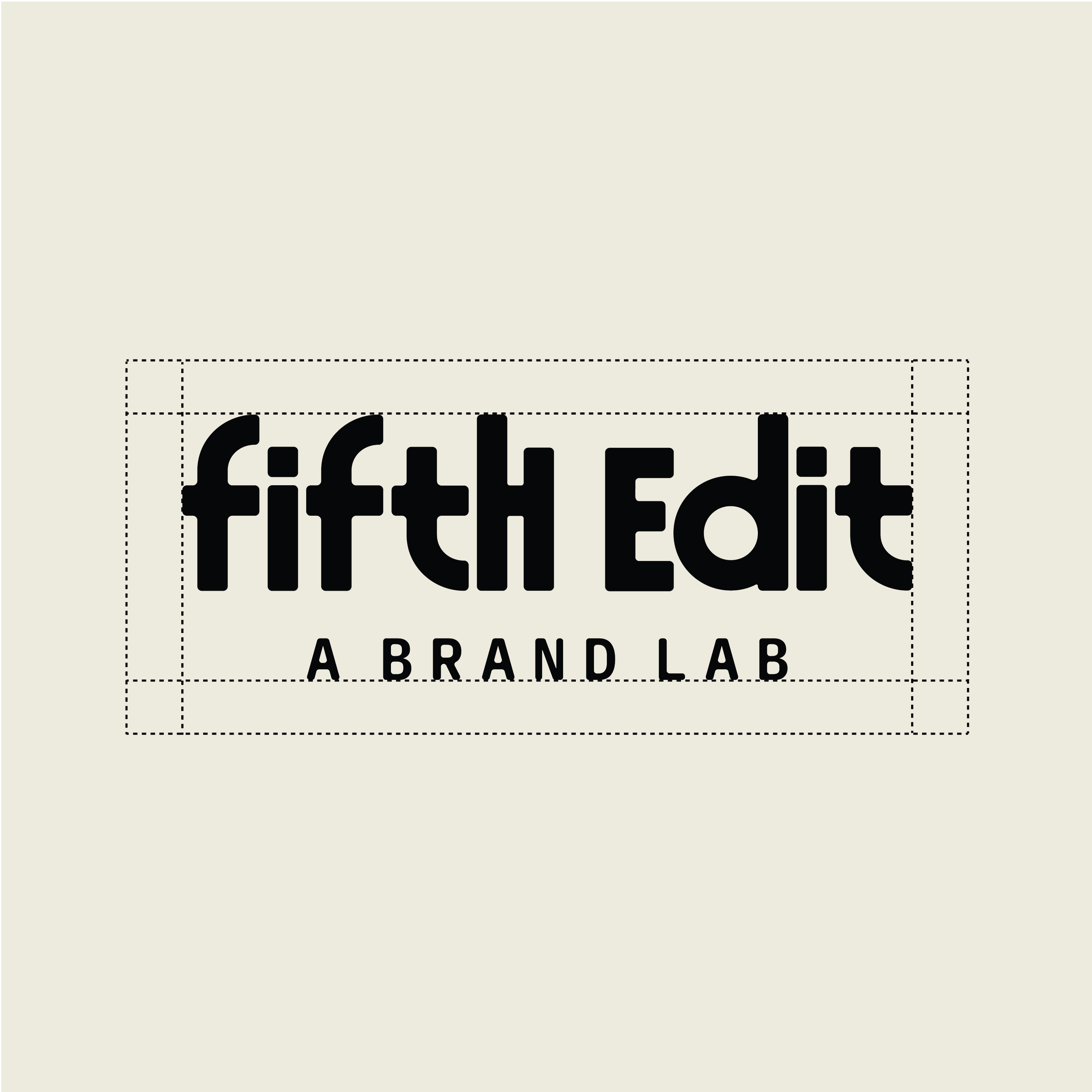
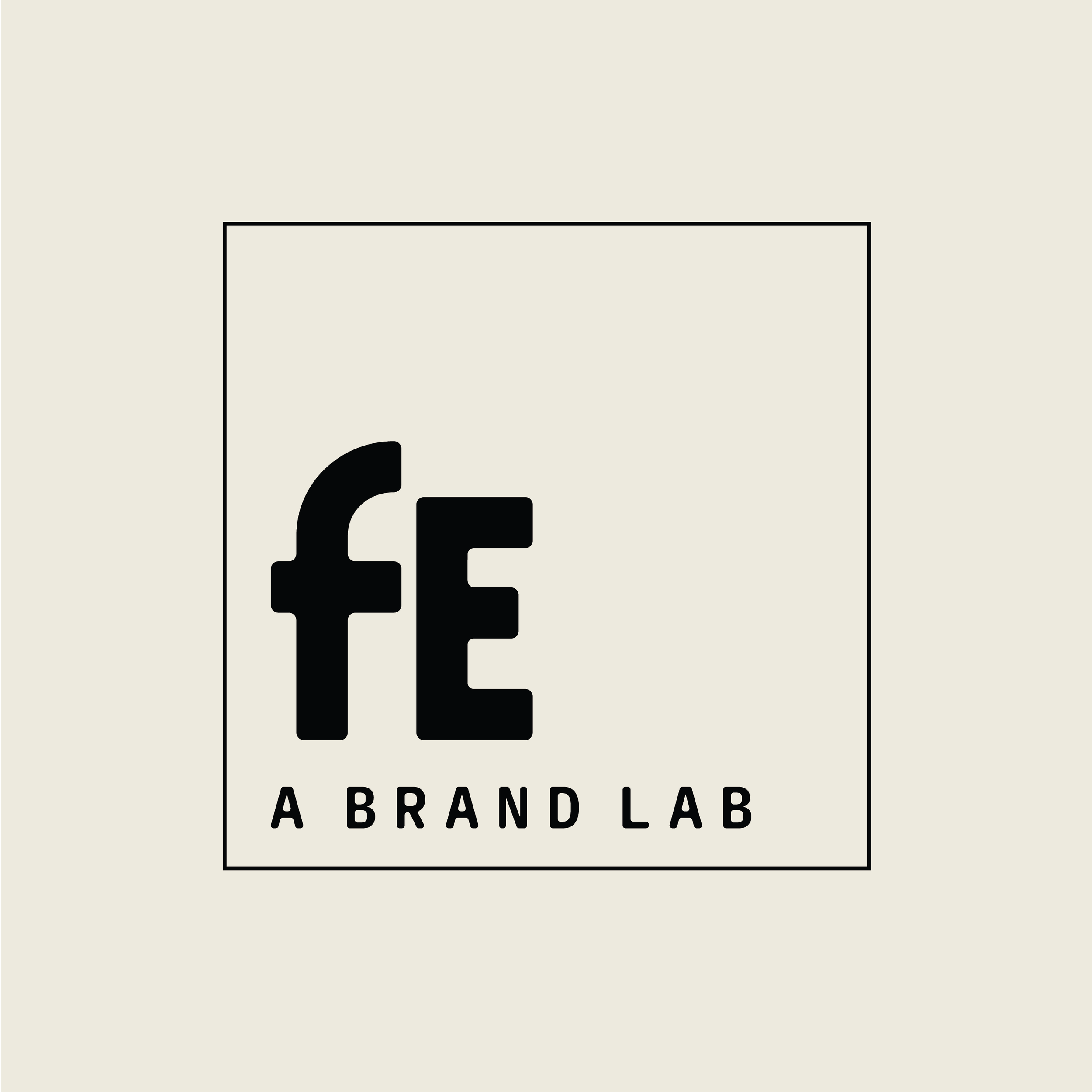
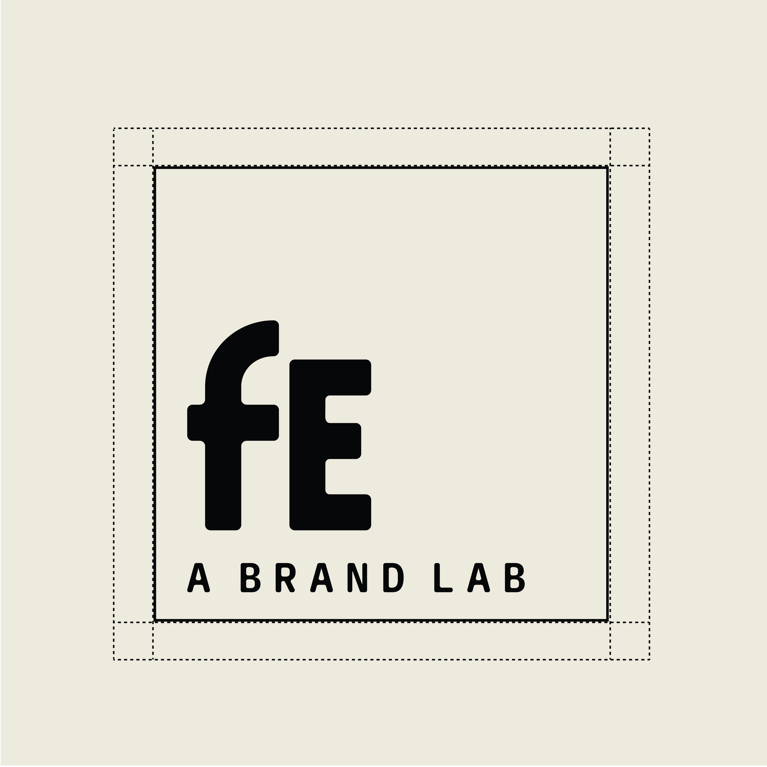
Primary logo
This version of our logo is the signature of our brand and should be used most frequently when space allows for it.
Note the clear space of 150px (or the width of the “I” from the logo) whiich shows the minimum distance that should be created between the logo other elements.
Secondary logo
The secondary logo uses components from your main logo but in a variation. This is to be used when the primary logo doesn’t fit in the required space.
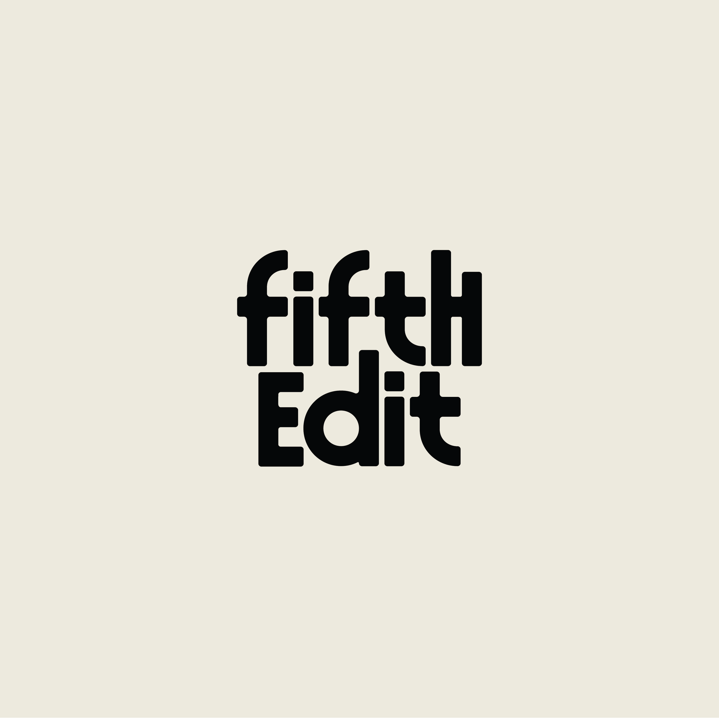
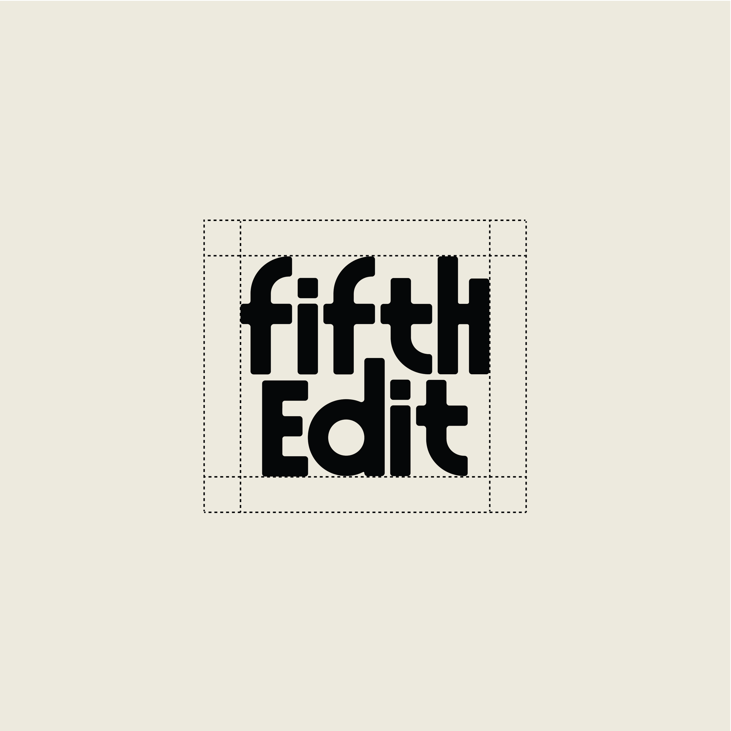
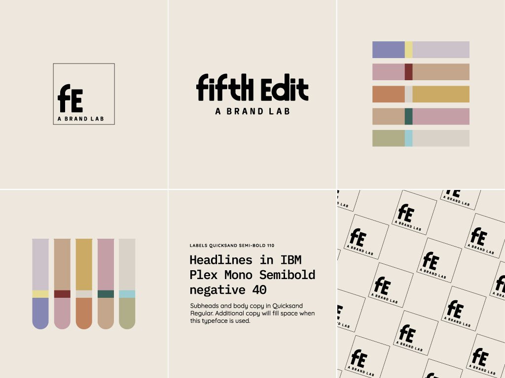
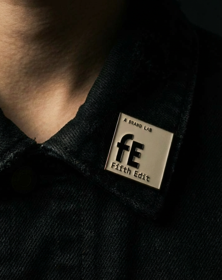
Submark
The submark is another variation of your logo with simplifications and an alternate layout. This is to be used in spaces where your brand has already been introduced when your primary logo will not fit the required space.
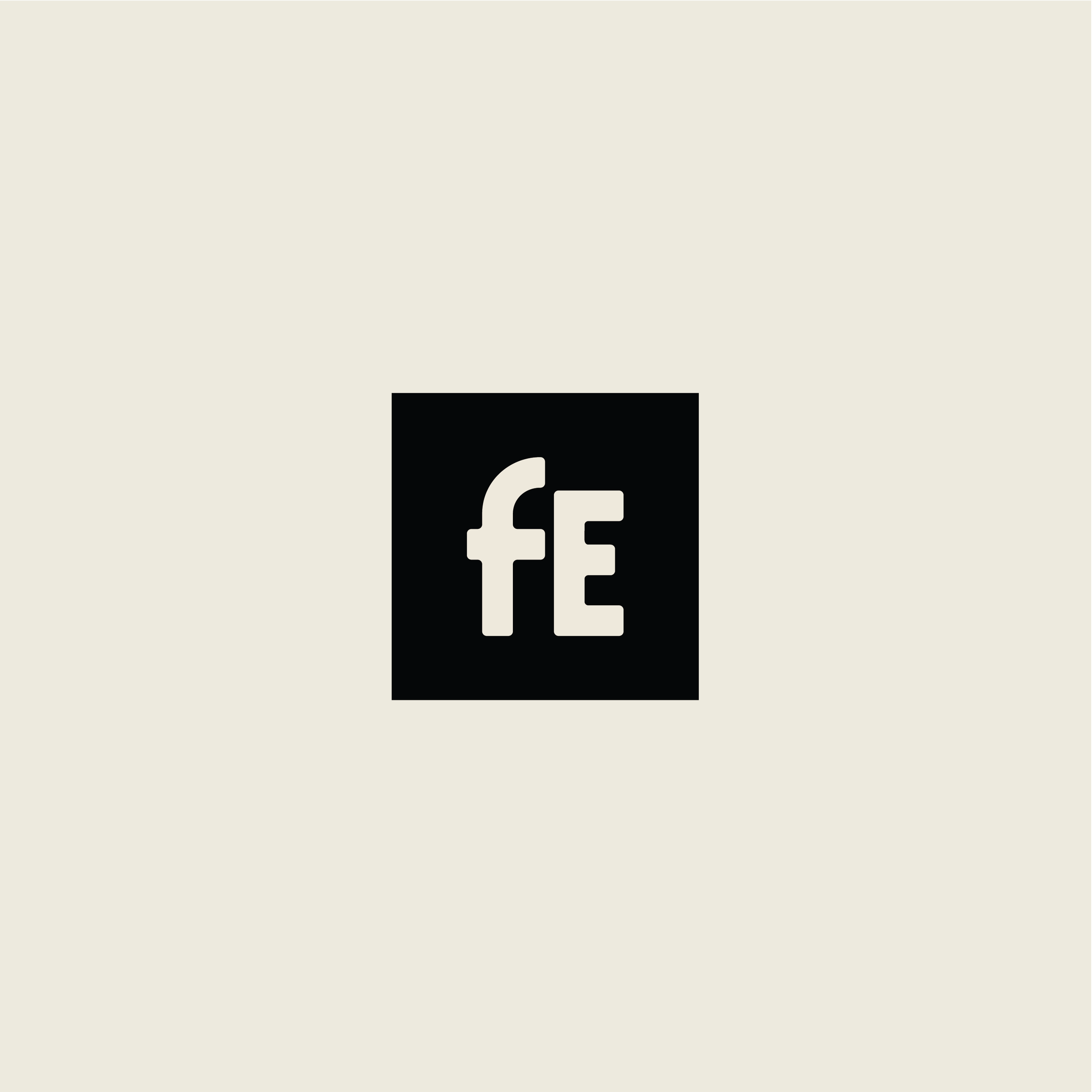
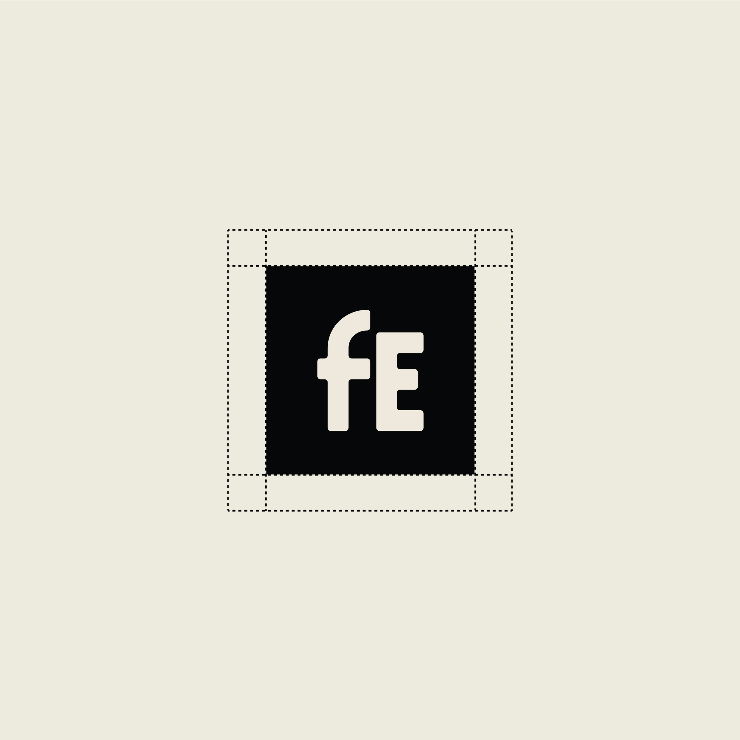
Logo mark
The logo mark is an ultra-simplified version of your logo. It consists of an icon/symbol that can be used in confined spaces like social media avatars, stamps, favicon etc.
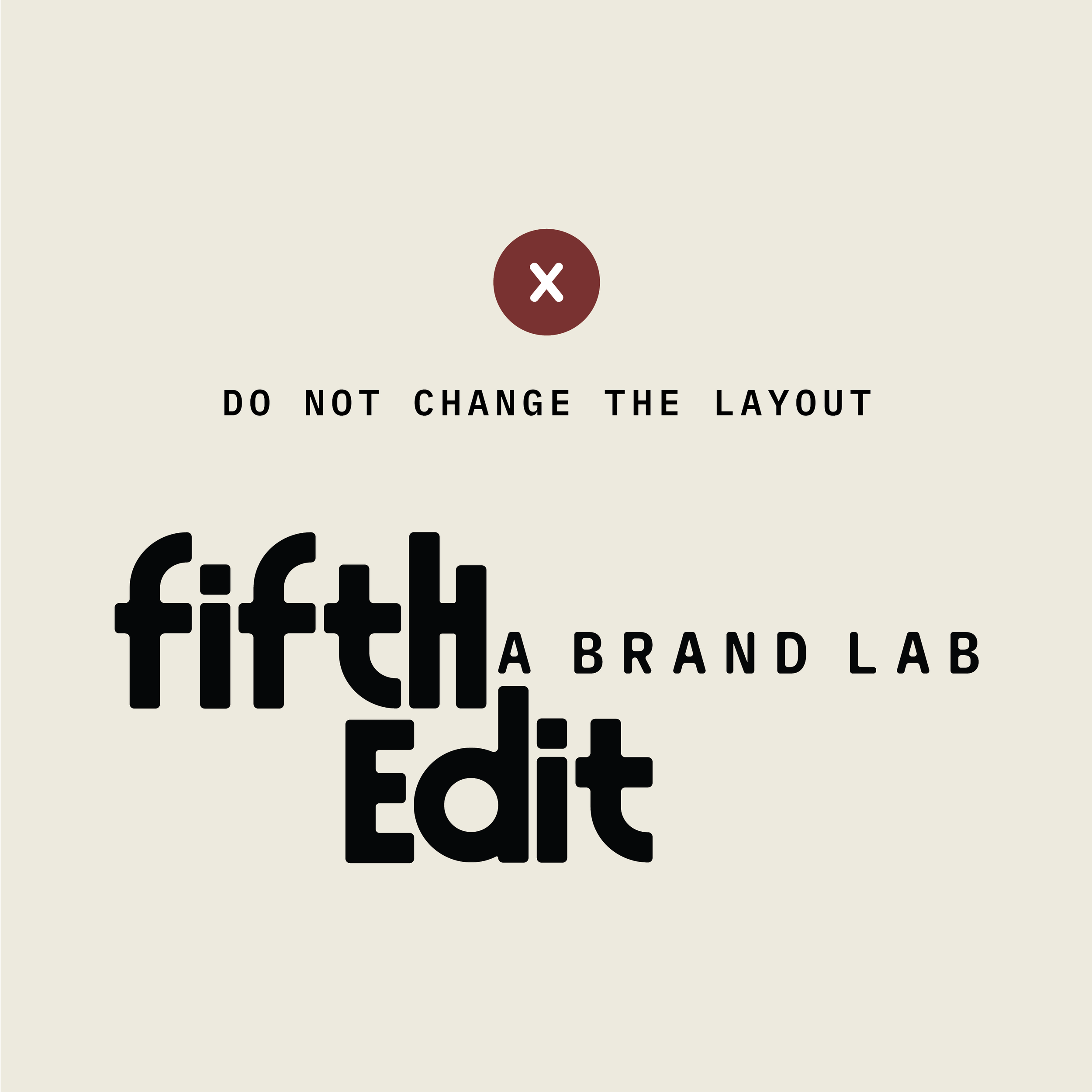
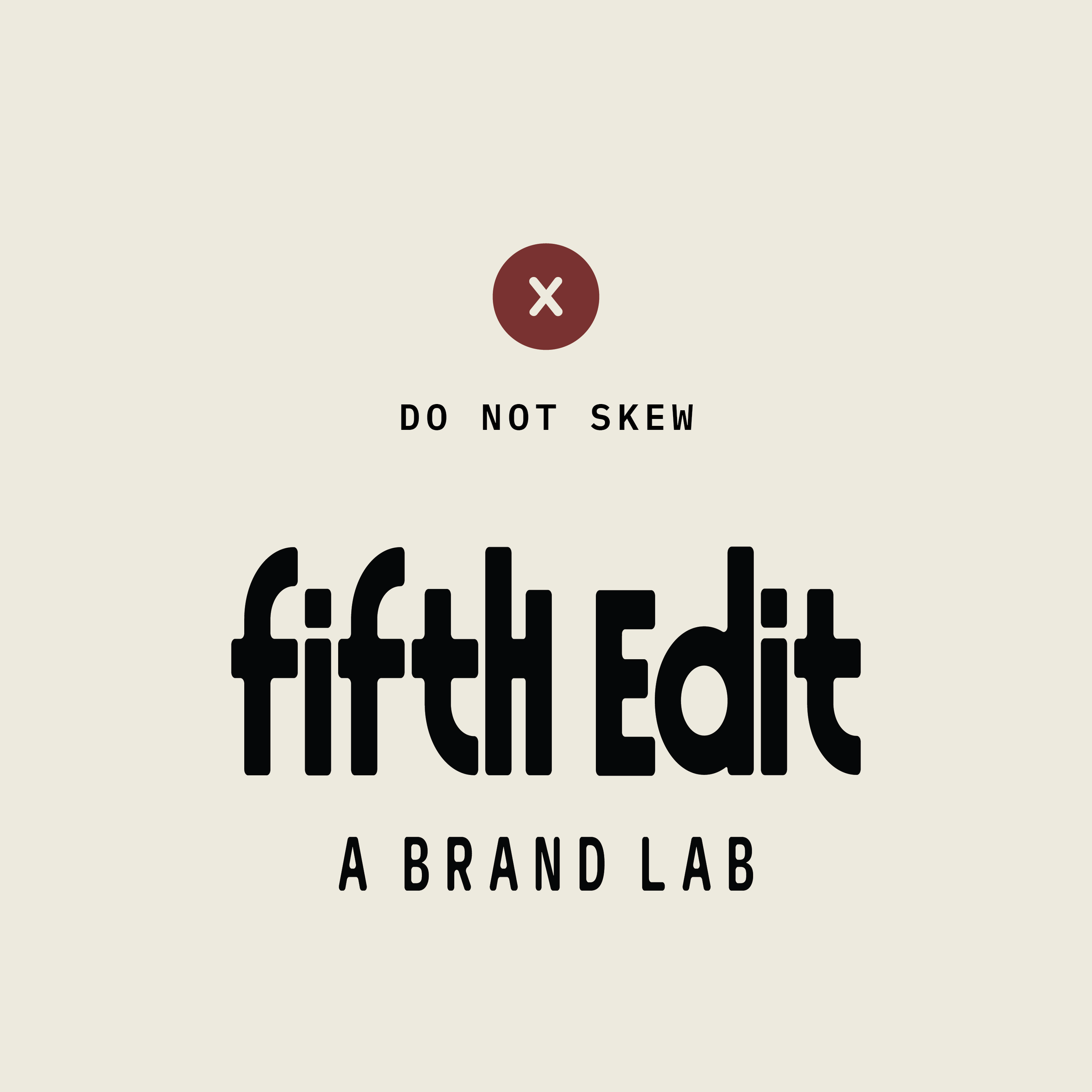
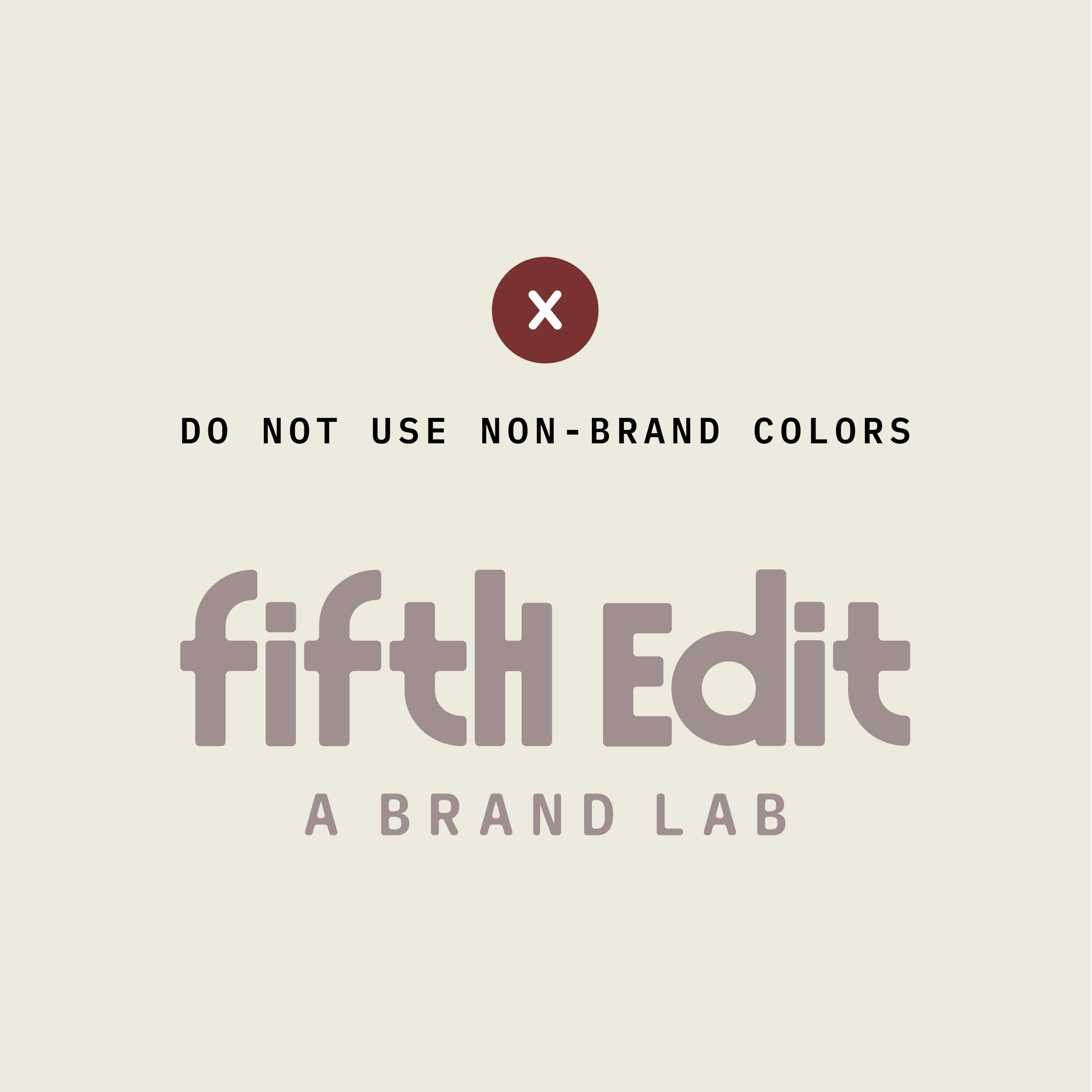
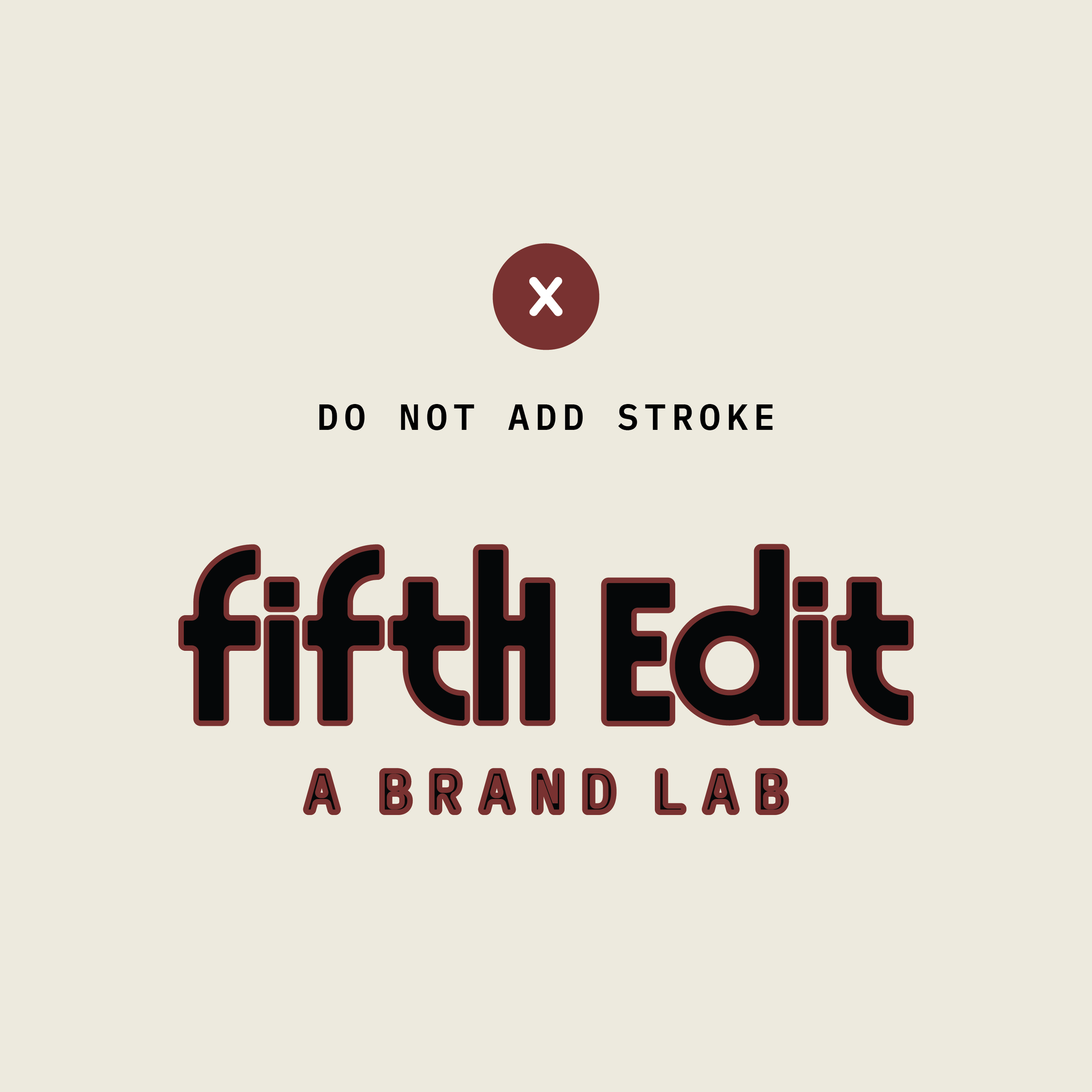
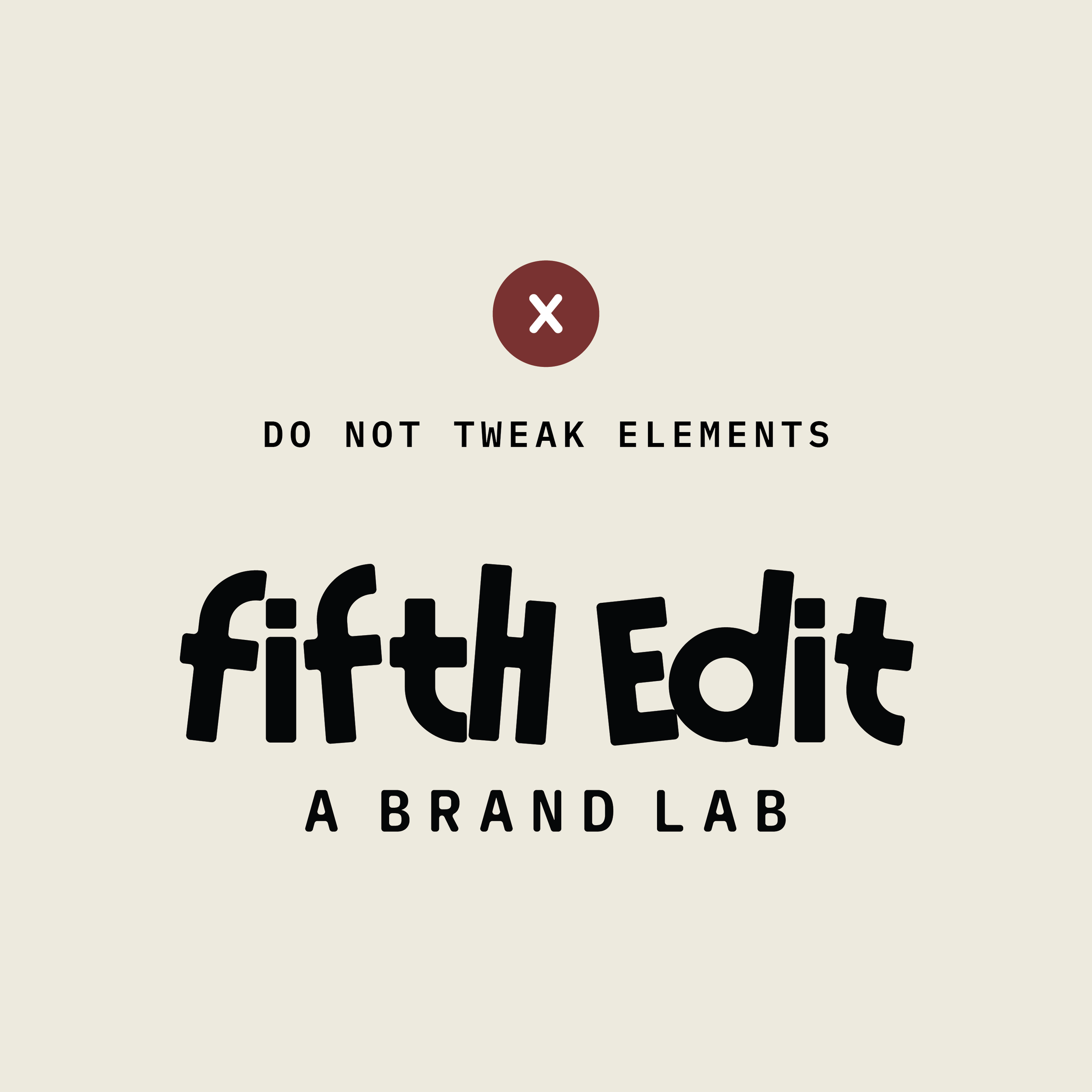
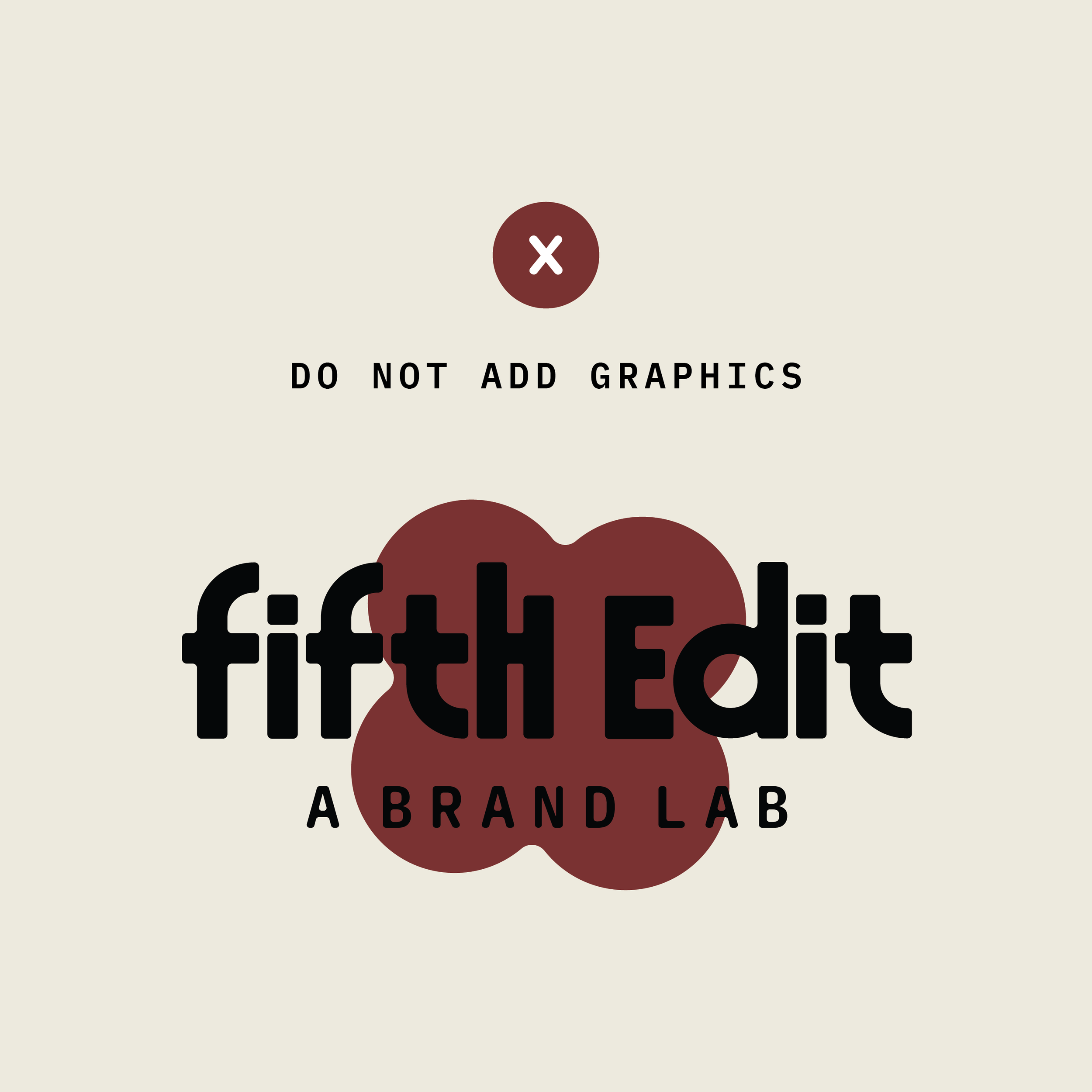
Incorrect usage
Your logo should not be altered in any way, including extending, condensing, outlining, adding strokes or drop shadows. When the logo is altered, you’re actually deviating away from the strength of the brand identity.
Color palette
Color is a core part of our visual identity — setting the tone, evoking emotion and helping our brand stand out.
Our palette is designed to be flexible and expressive, with combinations that work across a range of applications.
Follow the guidelines below to use color with consistency, clarity, and intention.
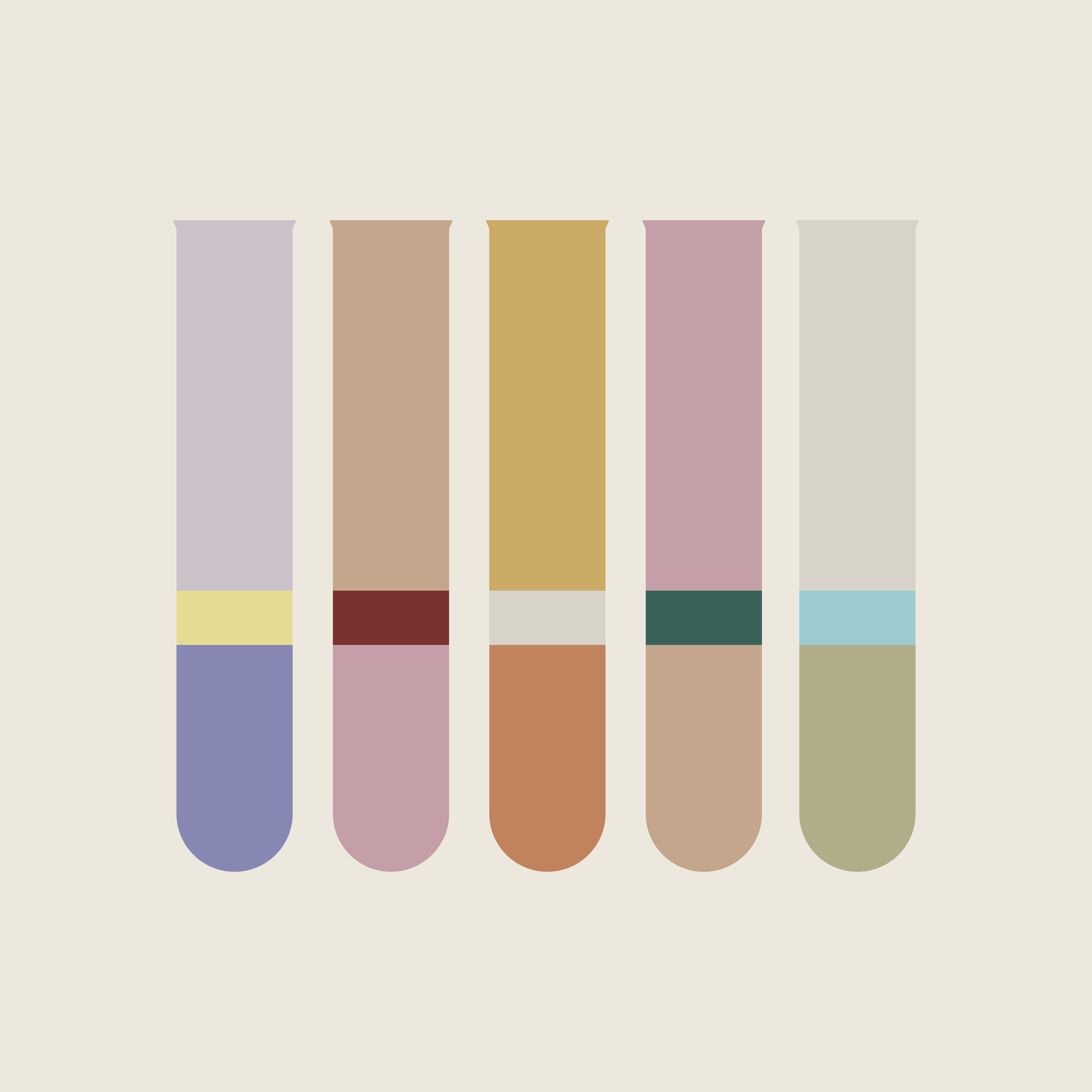
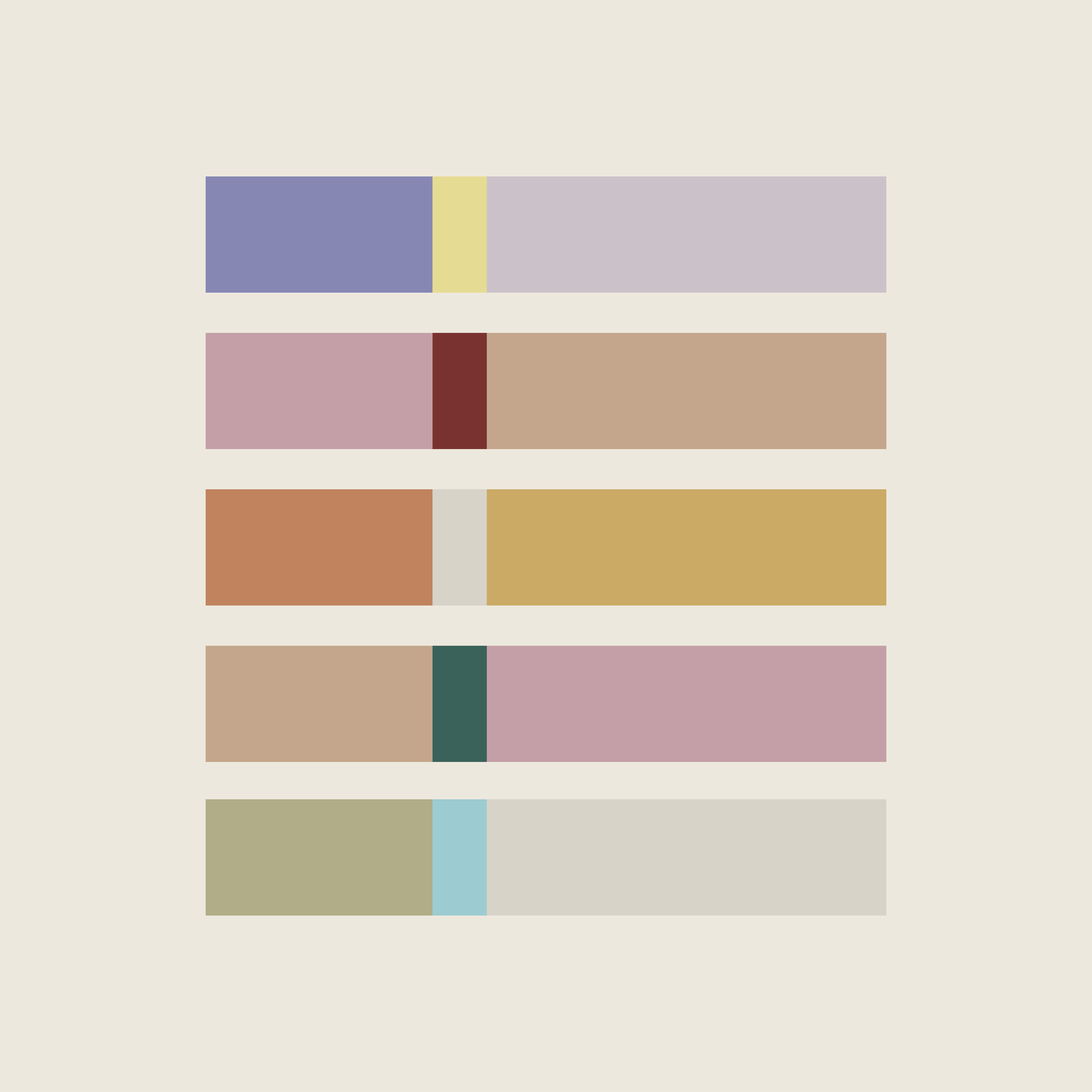
Strategic Stacks
Built around Fifth Edit’s five-week signature program, our base color stack and supporting five color stacks are intentionally arranged to resemble DNA sequences, a direct extension of our brand-lab concept.
CMYK: Use for printed materials.
RGB/HEX: Use for digital design.
00 Base Stack
White
Hex: #FEFAF4
RGB: 254, 250, 244
CMYK: 0, 1, 3, 0
Beige
Hex: #EDE8DD
RGB: 237, 232, 221
CMYK: 6, 6, 12, 0
Black
Hex: #000000
RGB: 0, 0, 0
CMYK: 75, 68, 67, 90
01 Strategy Stack
Perriwinkle
Hex: #8688B3
RGB: 134, 136, 179
CMYK: 51, 45, 8, 0
Lime
Hex: #E6DB93
RGB: 230, 219, 147
CMYK: 10, 8, 56, 0
Lavender
Hex: #CBC2C9
RGB: 203, 194, 201
CMYK: 19, 22, 13, 0
02 Visual Identity Stack
Blush
Hex: #C49FA7
RGB: 196, 159, 167
CMYK: 20, 41, 23, 0
Sand
Hex: #C3A68B
RGB: 195, 166, 139
CMYK: 22, 35, 47, 0
Cherry
Hex: #793220
RGB: 121, 50, 48
CMYK: 31, 89, 79, 33
03 Website Stack
Caramel
Hex: #C0835E
RGB: 192, 131, 139
CMYK: 22, 35, 47, 0
Mustard
Hex: #CBAA65
RGB: 203, 170, 101
CMYK: 21, 31, 71, 0
Gray
Hex: #D8D3C8
RGB: 216, 211, 200
CMYK: 14, 13, 20, 0
04 Content Kit Stack
Sand
Hex: #C3A68B
RGB: 195, 166, 139
CMYK: 22, 35, 47, 0
Evergreen
Hex: #3A625A
RGB: 58, 98, 90
CMYK: 78, 44, 61, 26
Blush
Hex: #C49FA7
RGB: 196, 159, 167
CMYK: 20, 41, 23, 0
05 Launch Stack
Sage
Hex: #B0AD88
RGB: 176, 173, 136
CMYK: 33, 25, 51, 0
Sky
Hex: #9CCCD1
RGB: 156, 204, 209
CMYK: 38, 6, 17, 0
Gray
Hex: #D8D3C8
RGB: 216, 211, 200
CMYK: 14, 13, 20, 0
Typography
Typography plays a key role in shaping our brand’s voice — helping to convey our personality across all communication.
Our type system is designed to be flexible and legible.
Follow the guidelines below to maintain consistency and make sure our message always comes through loud and clear.
Primary Typeface
The primary typeface is our default typeface & should be used for headers, subheadings and titles. It should be used in up/down casing.
IBM Plex Mono
AaBbCcDdEeFfGgHhIiJjKkLlMmNnOoPpQqRrSsTtUuVvWwXxYyZz
Secondary Typeface
The secondary typeface complements our primary typeface & will be used for labels in all caps and body copy in up/down casing.
Quicksand
AaBbCcDdEeFfGgHhIiJjKkLlMm
NnOoPpQqRrSsTtUuVvWwXxYyZz
Typeface Usage
Typefaces and their subsequent uses (shown here) have been chosen for readability and alignment with our brand-lab concept. IBM Plex Mono lends itself well to a scientific, analog feel. Quicksand’s subtle, soft curves provide excellent legibility and contrast to IBM Plex Mono’s rigidity.
LABELS IN QUICKSAND
Headlines in IBM Plex Mono Semibold
Subheads and body copy in Quicksand Regular. Additional copy will fill space when this typeface is used.
Incorrect Usage
Avoid the following common type usage mistakes.
Avoid using all caps for long passages of text as it can make the text appear aggressive or difficult to read.
Avoid using too much or too little line spacing as it can make text hard to read and disrupt visual flow.
Avoid placing text too close to the edges of a page or other design elements.
Avoid inconsistent alignment within the same design space i.e. a left-aligned headline and centered body copy.
Illustrations & patterns add a creative flair that makes our brand distinctive, brings out personality and creates a memorable brand experience.
Using these elements is an effective way to build our brand’s recognition across every touch point, maintaining cohesion.
Brand assets
Illustrations
Created using our brand’s distinct color stacks, these illustrations mirror test tubes and DNA sequences, aligning with our brand-lab concept. The elements in each illustration may be used as a standalone element if needed.
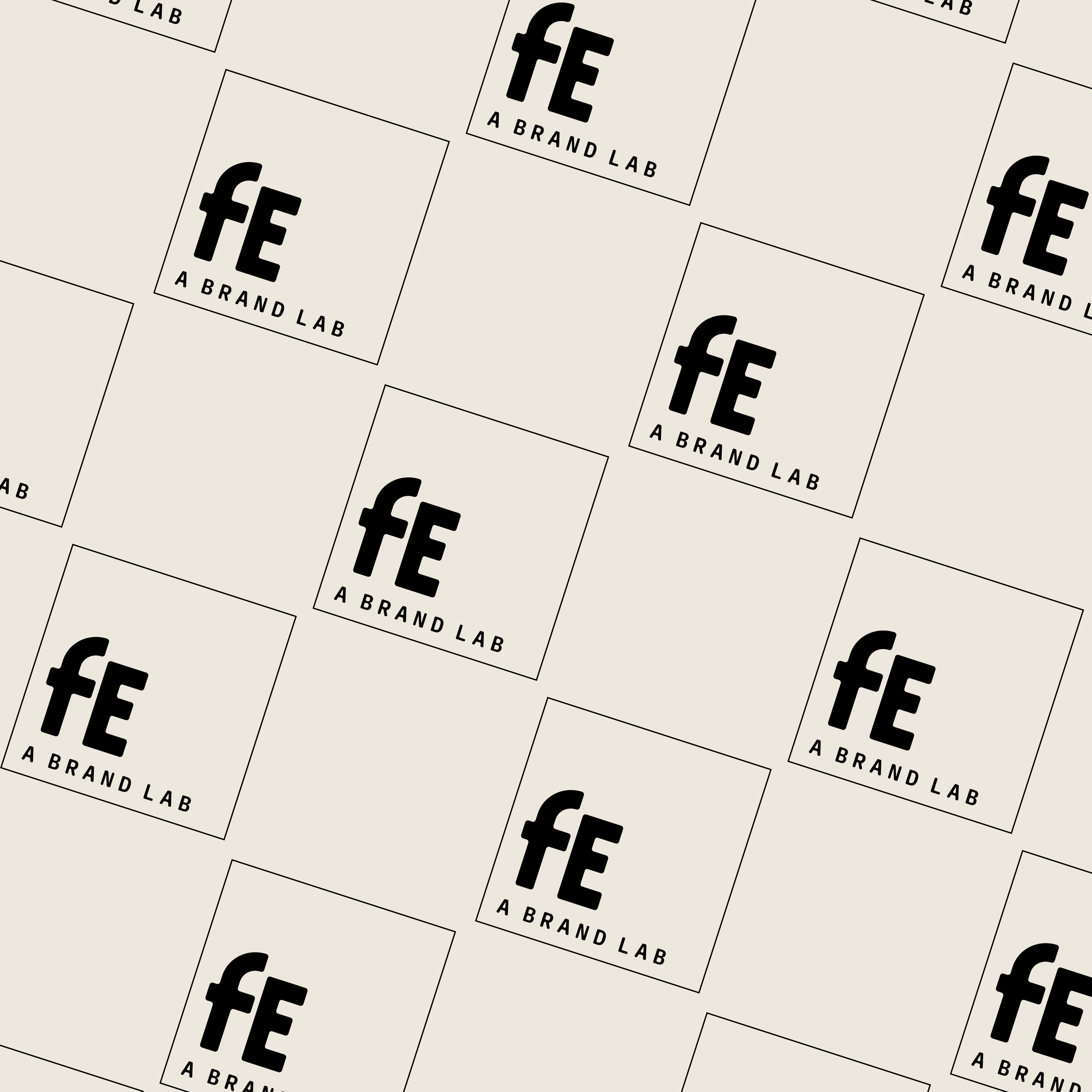
Pattern
Our brand’s pattern uses our brand submark with a composition that nods to the periodic table. Again, we’re maintaining consistency and a keeping visuals aligned with our brand-lab concept.